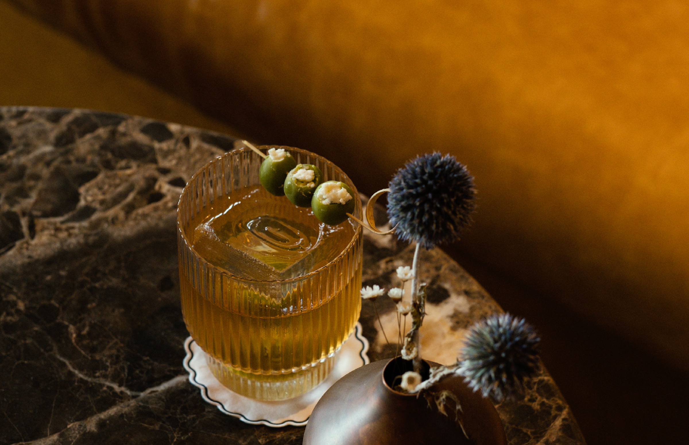
Fine Appalachian-inspired dishes you wish your grandma made. Granddam is The Manchester’s expansive Appalachian dining hall — and also the name of a matriarchal racehorse, past her prime but living the dream.
GRANDDAM
Granddam's branding takes a playful approach and imagines our racehorse as the grandmother racing horse in her retirement. She no longer has to run for the roses, it's her time to kick back, have a glass of Bourbon, eat whatever she likes and lie down in the sun.
SCOPE
Brand Identity
Printed Collateral
Uniform
CREDITS
Photography: Matt Kisiday & Ryan Neevan
Studio: Islyn Studio
Client: New Circle | Hank Morris & Nik Feldman
Website: granddamky.com
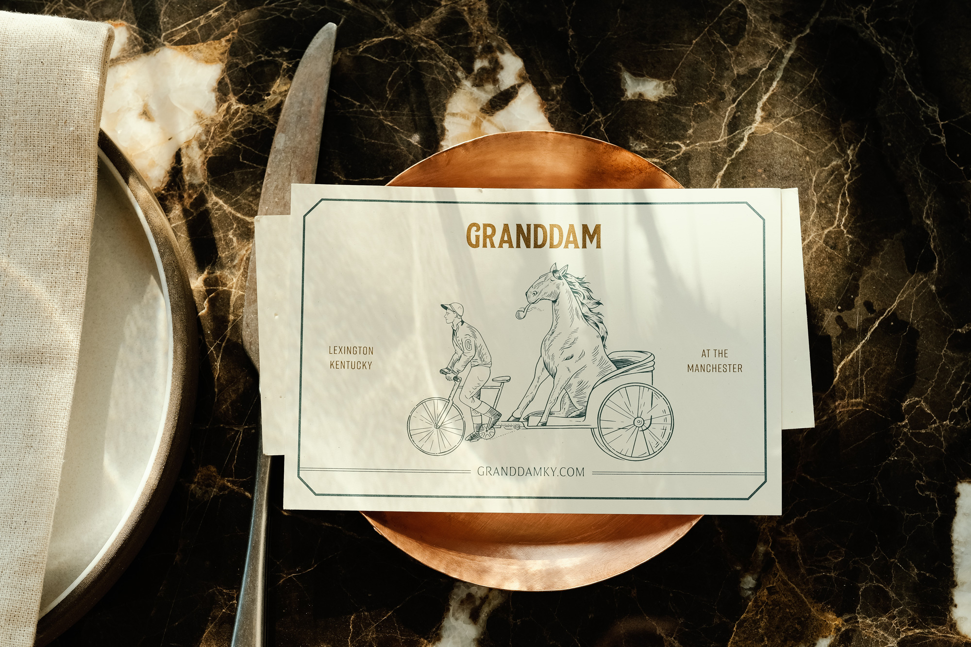
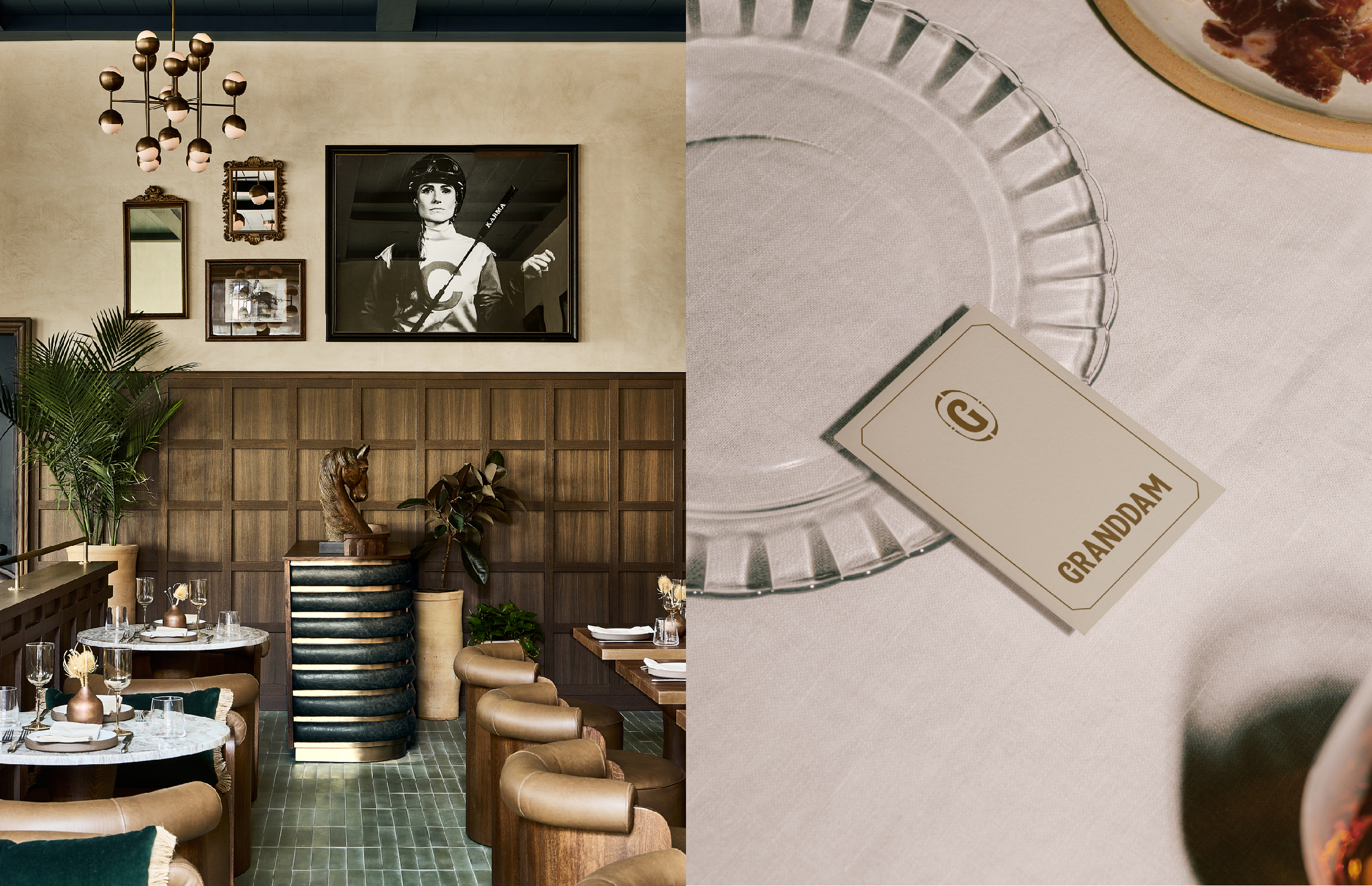
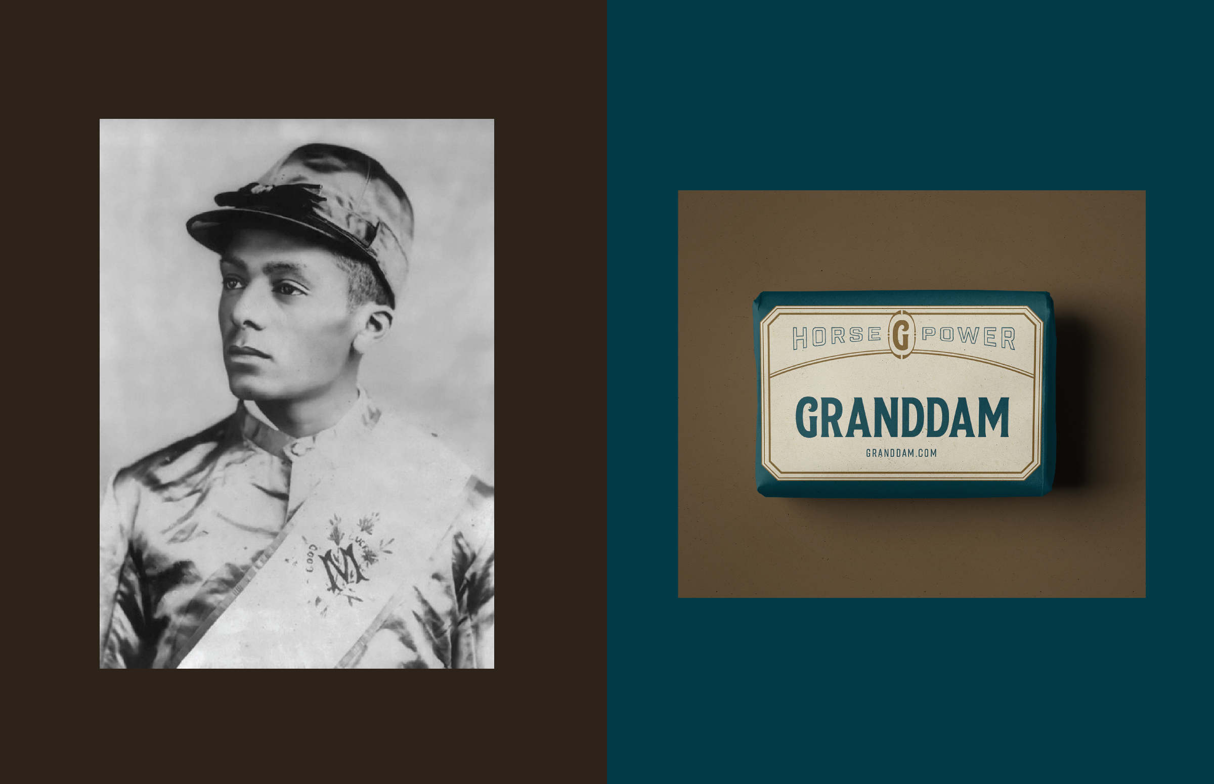
Our logo and emblem plays homage to the lesser known, first jockeys of racing. The first Kentucky Derby featured at least 12 young black men. They won 15 of the first 28 runnings with the very first Kentucky Derby, in 1875, won by Aristides and jockey Oliver Lewis. We reference their historic jersey silks through our emblem and logo and nod to them through our uniform design.
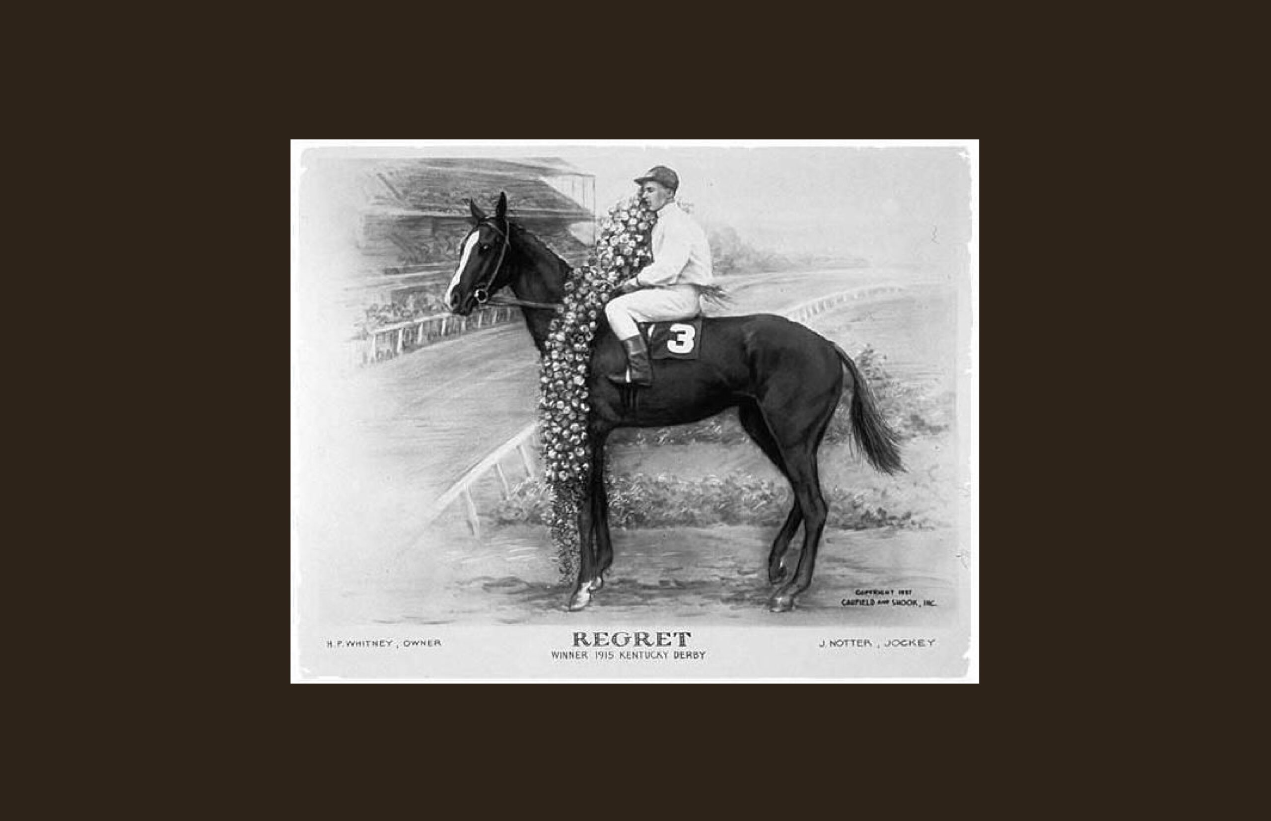
To accompany our logo and typography we created illustrations. Thoroughbreds are classified as “hot-blooded” horses, or horses that tend to be spirited, bold, highly intelligent, and athletic. Fillies (young female horses) are rare in the Kentucky Derby, with only 40 having competed since its first running in 1875.
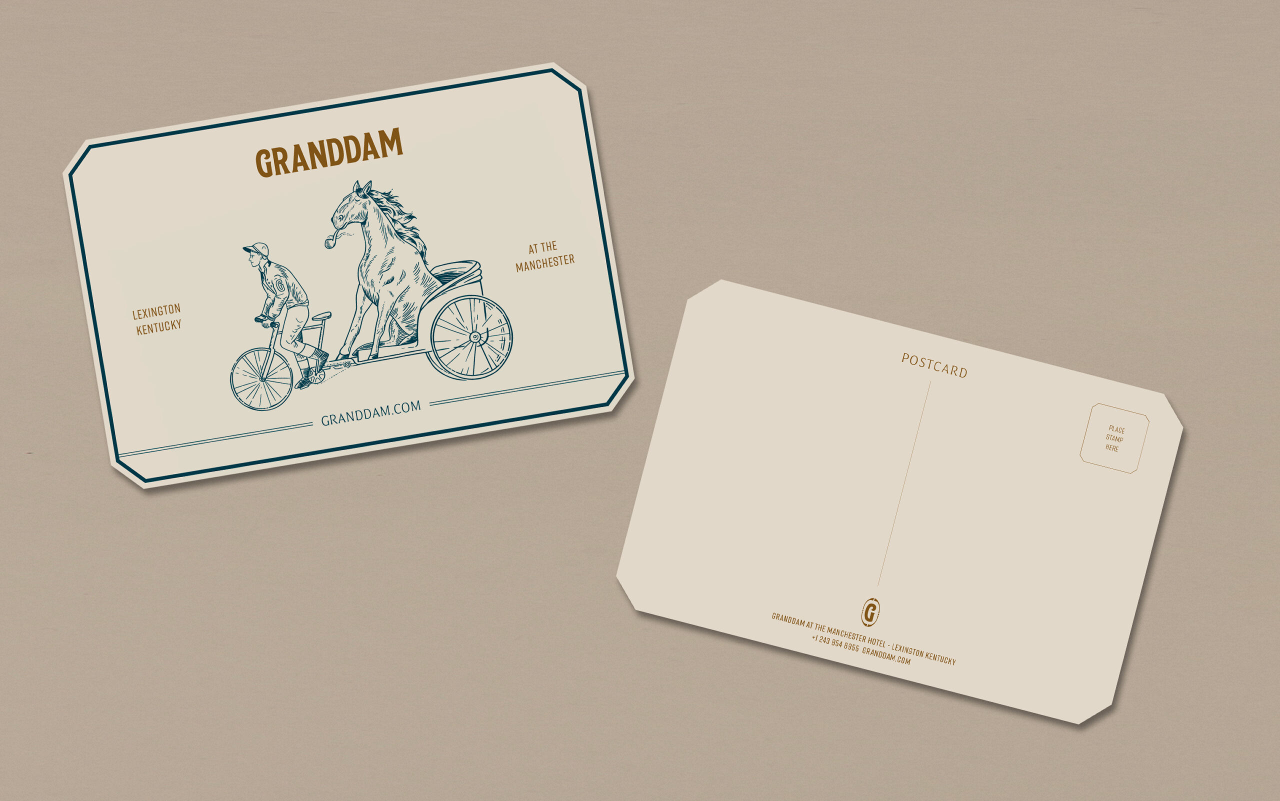
Just three fillies have managed to wear the garland of roses: Regret in 1915, Genuine Risk in 1980 and Winning Colors in 1988. Our playful illustrations were based on Regret, she has a distinct white marking on her face that our illustrator, Ivy Tan, referenced to create her character.
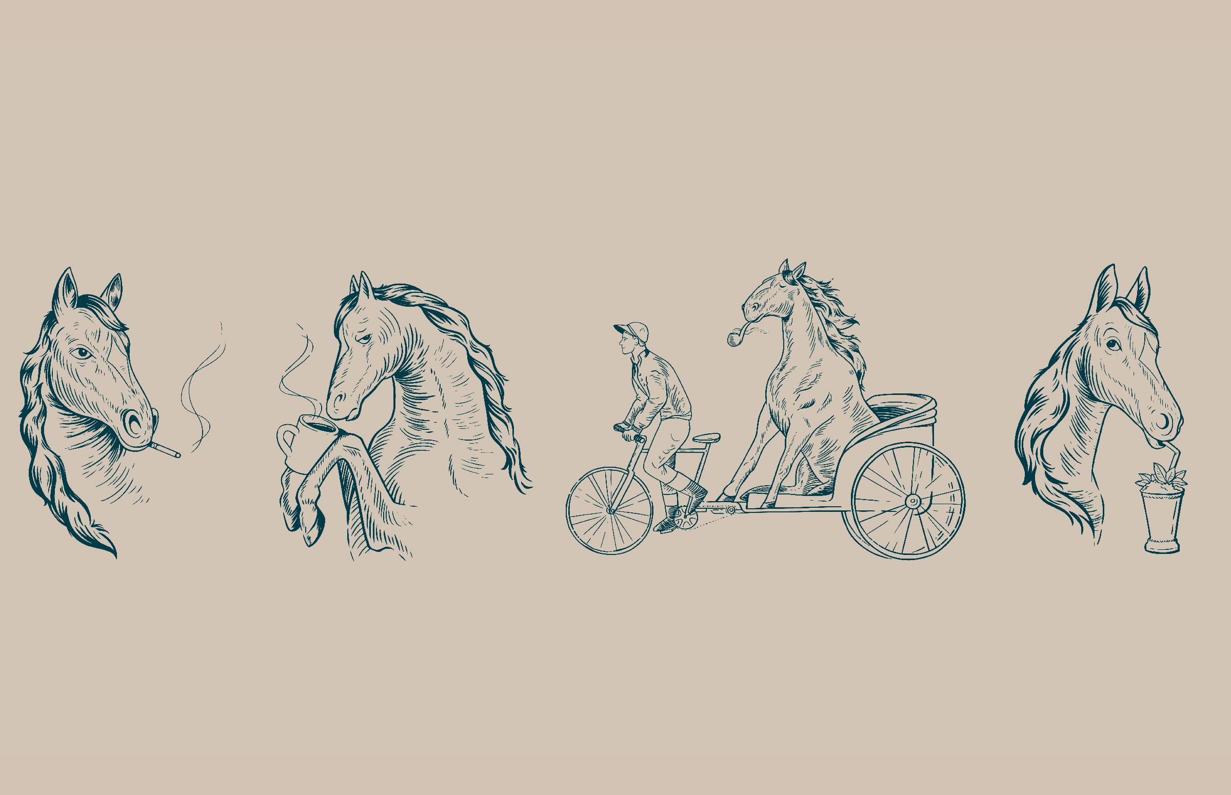
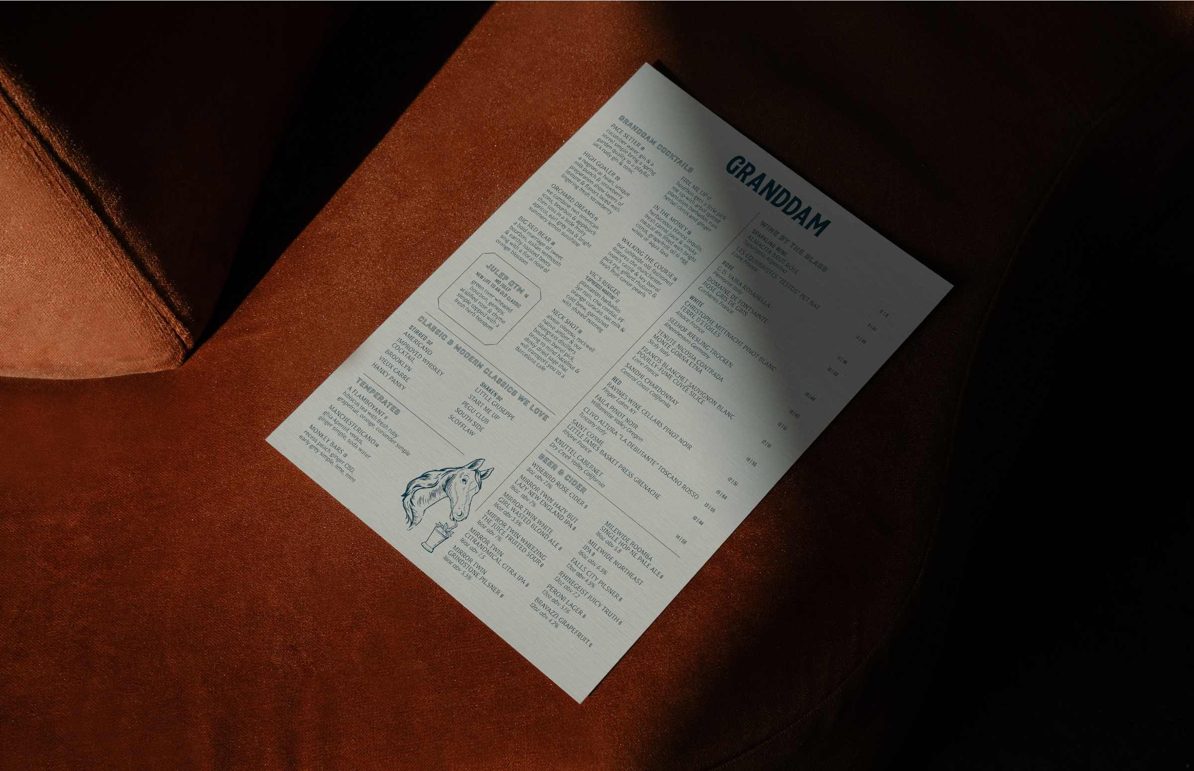
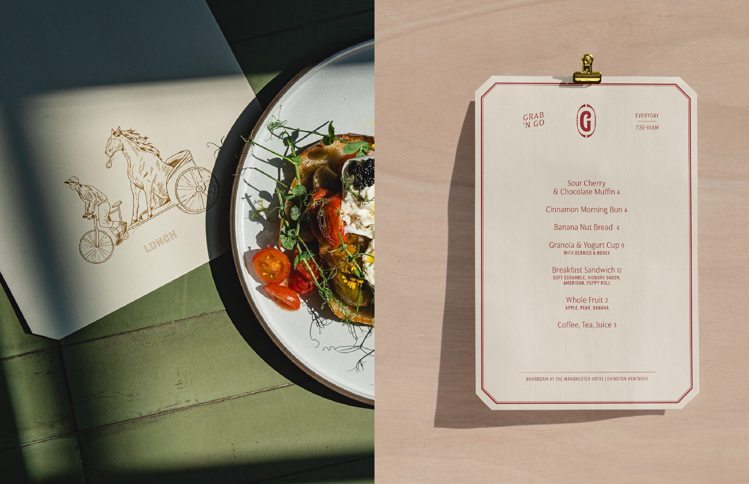
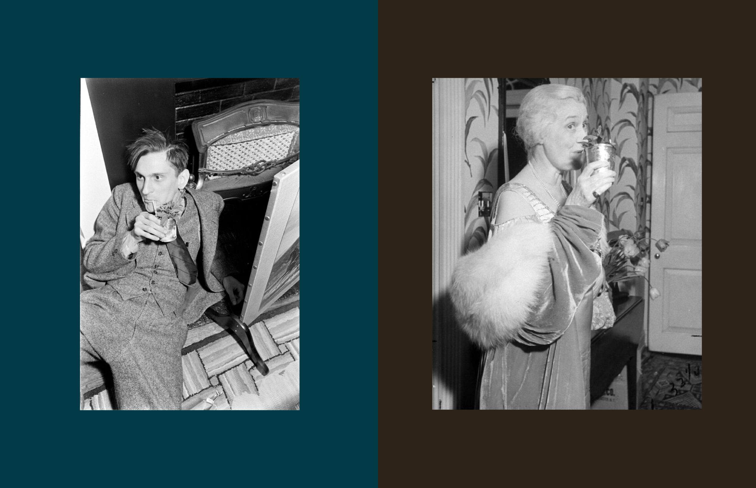
We referenced historic photography from the Kentucky Derby to create very human scenarios for our horse. Sipping a Mint Julep, chilling in the back of a cart being driven by a jockey, drinking coffee with a ‘don’t talk to me before i’ve had my morning coffee’ expression, and enjoying a smoke. We were inspired by everything from antique Japanese matches, the film maker and artist Agnès Varda, to Mr Ed in coming up with Regret’s storytelling.
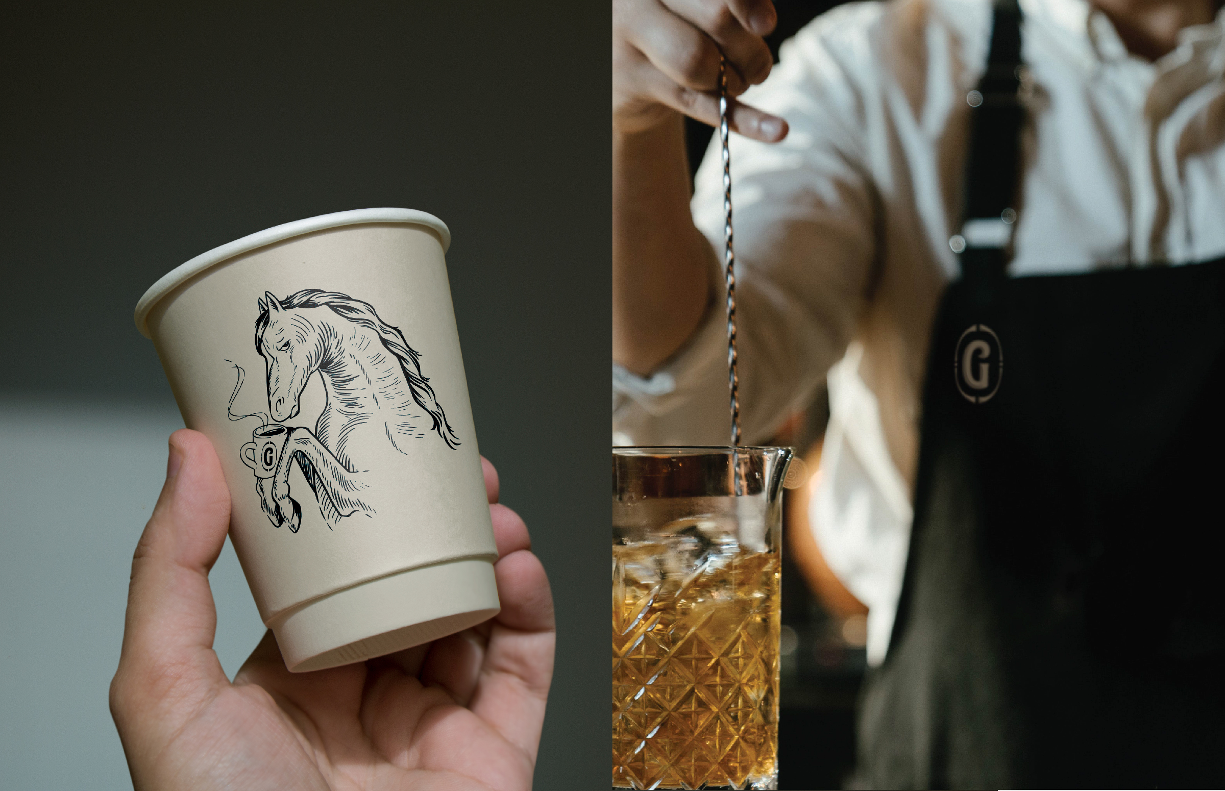
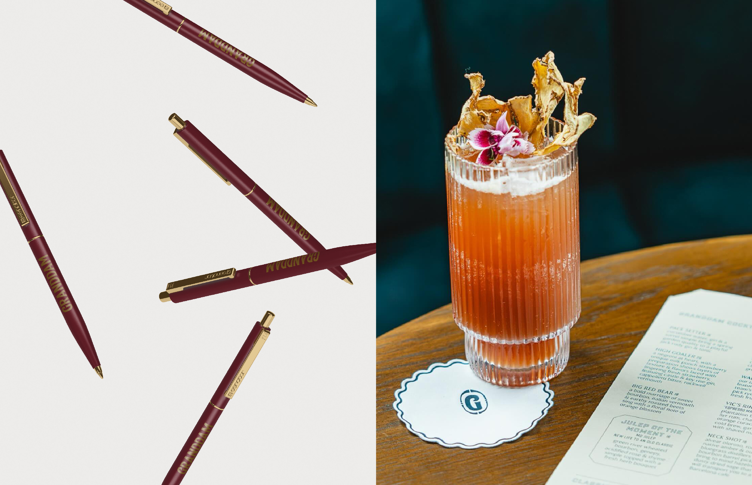
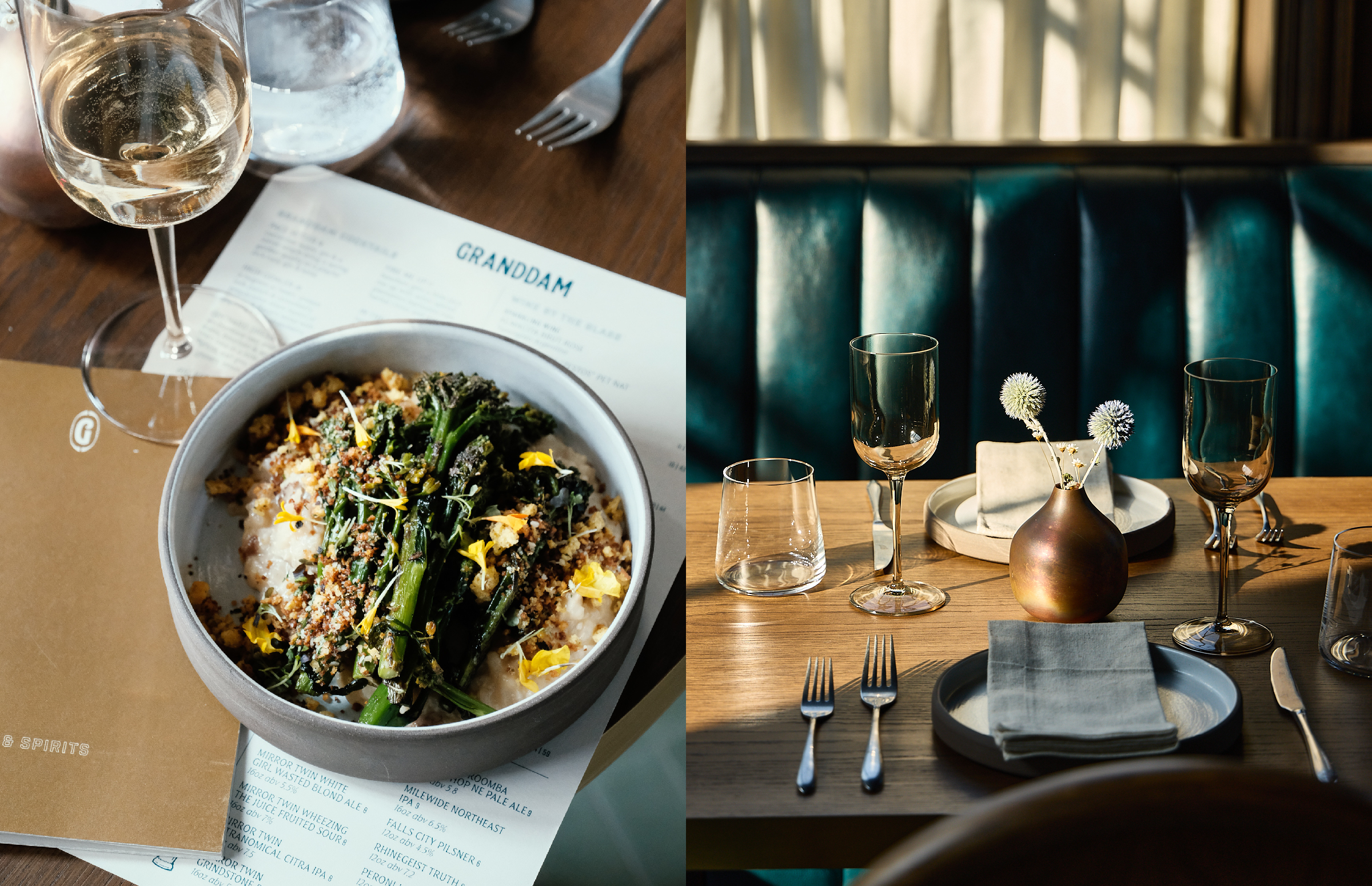
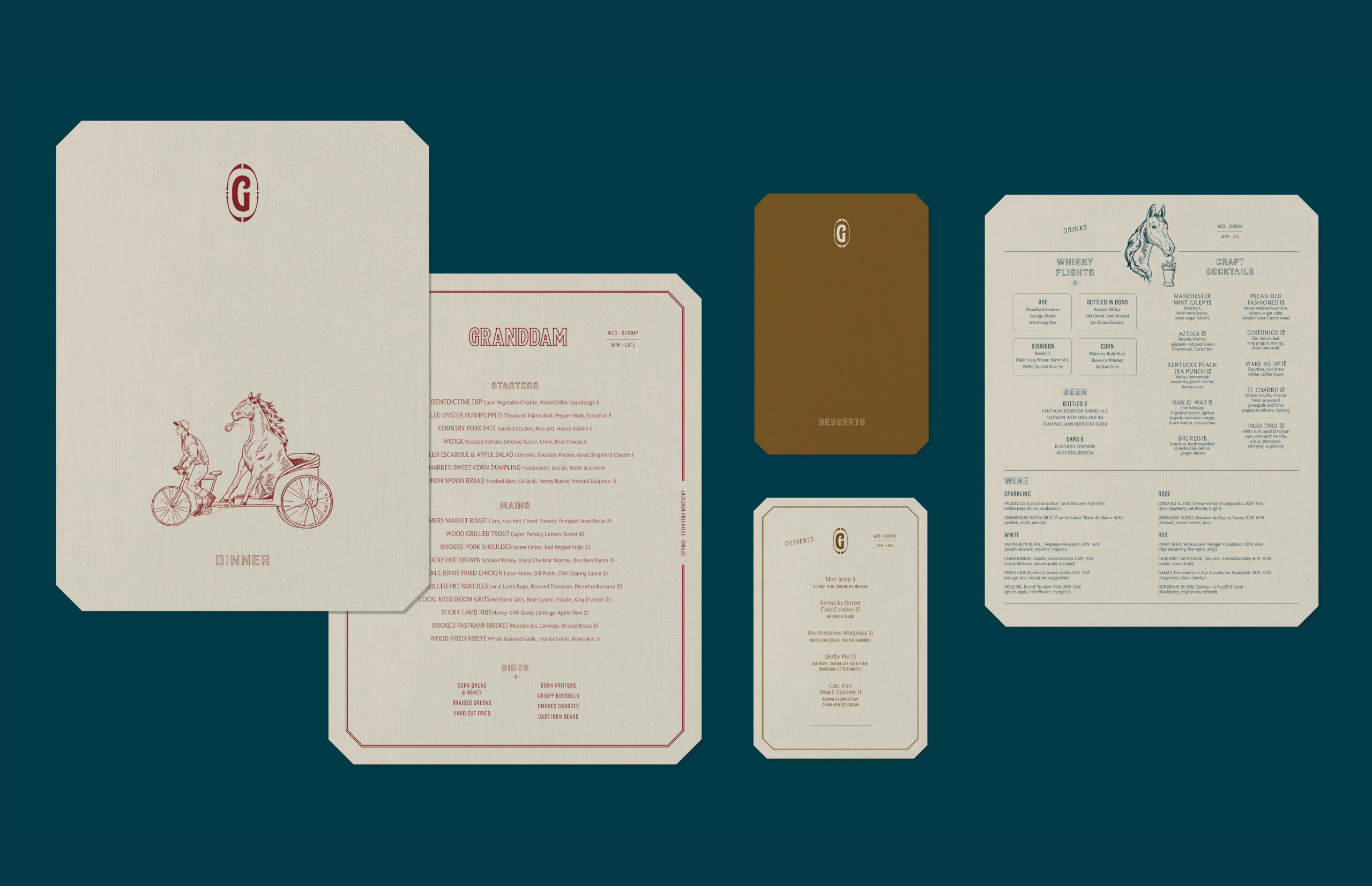
Finally, our typography looked to vintage Bourbon labels for reference. The restaurant is located in the historical Distillery District of Lexington, and this was the final piece of the story we wanted to tie in without being too direct.
