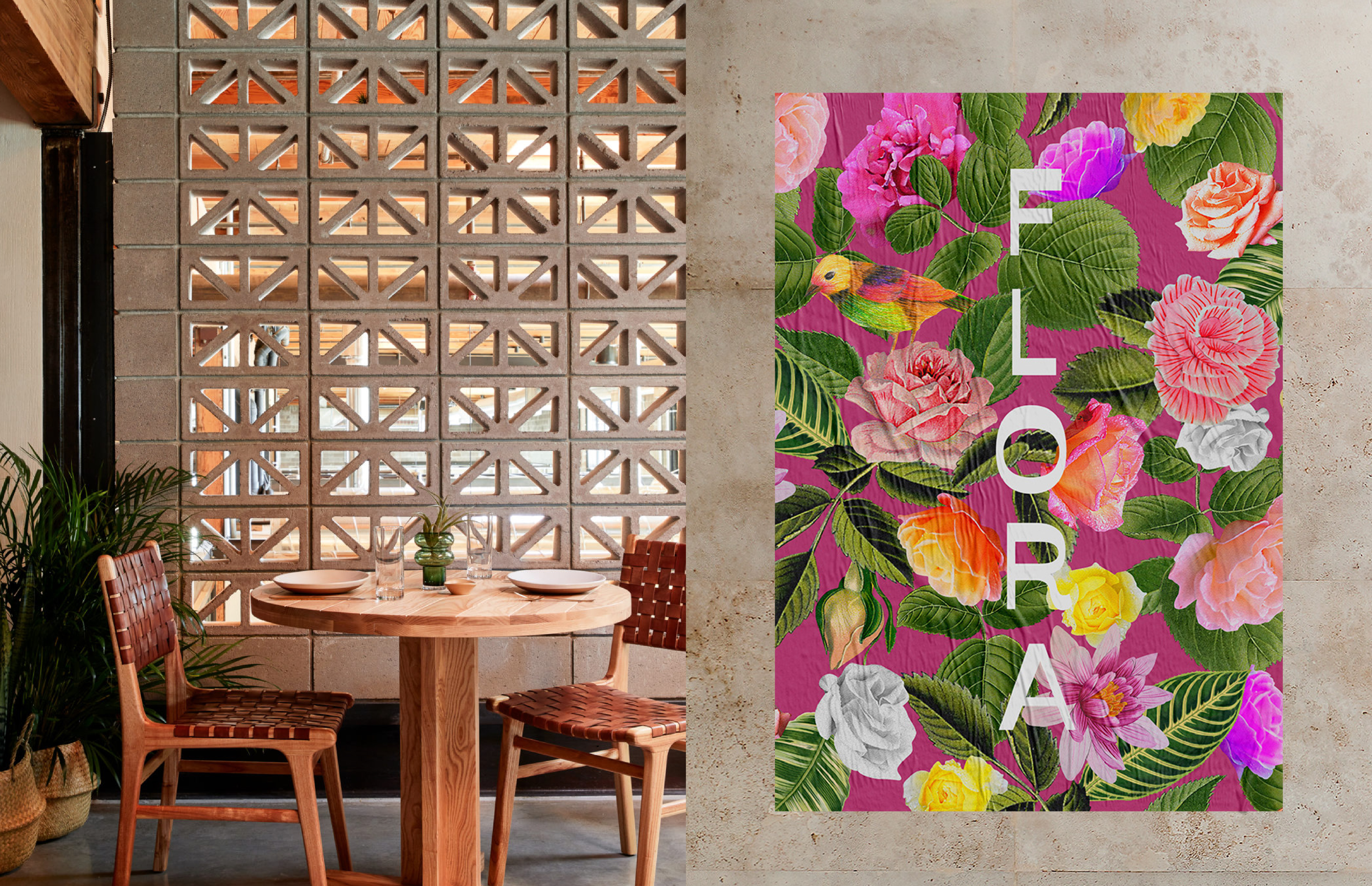
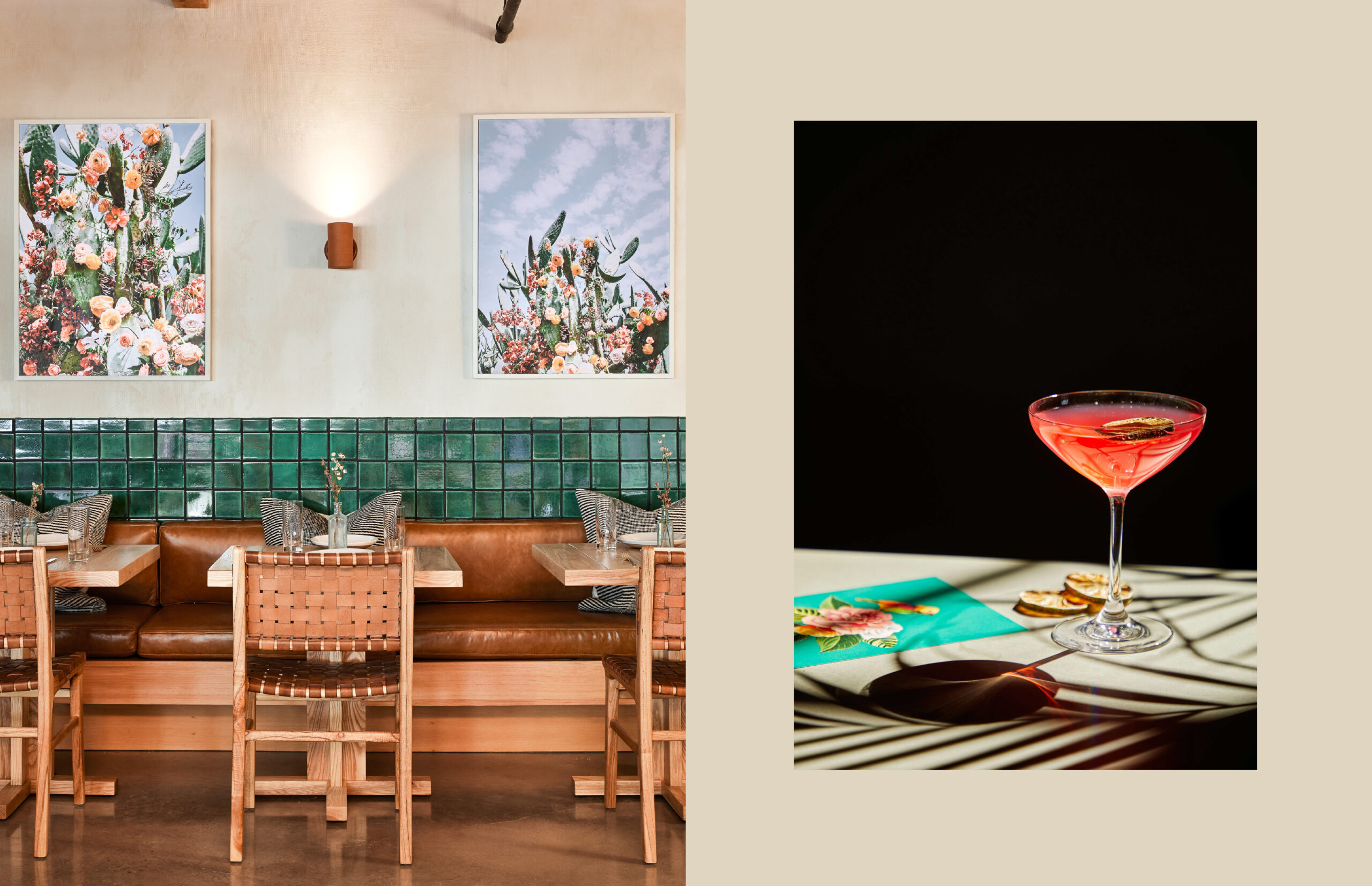
Brand identity, collateral and signage for Flora, a joyful, bold Mexican inspired restaurant in Sawmill Market.
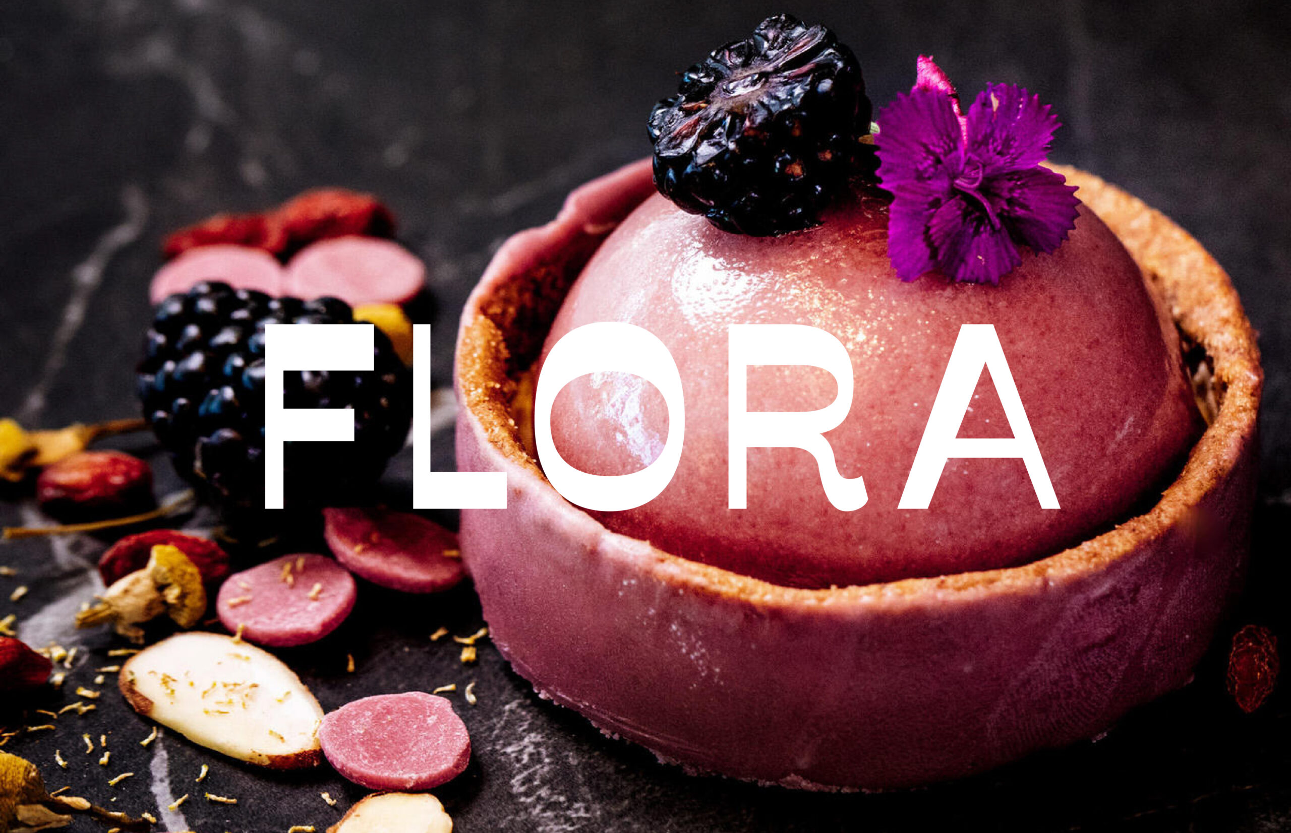
FLORA
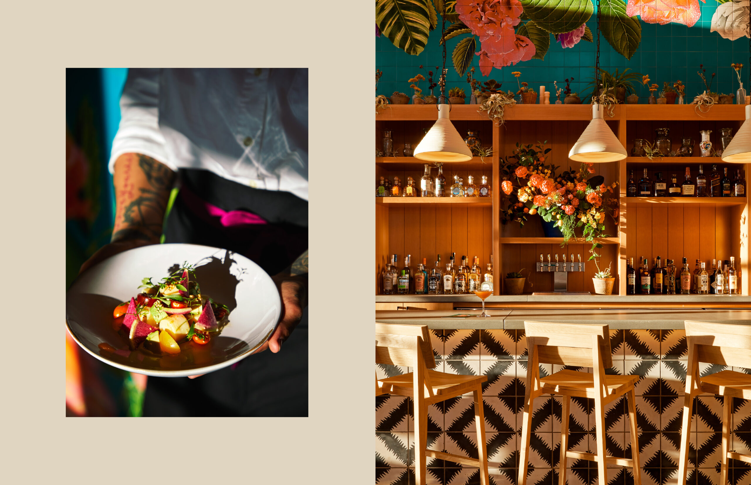
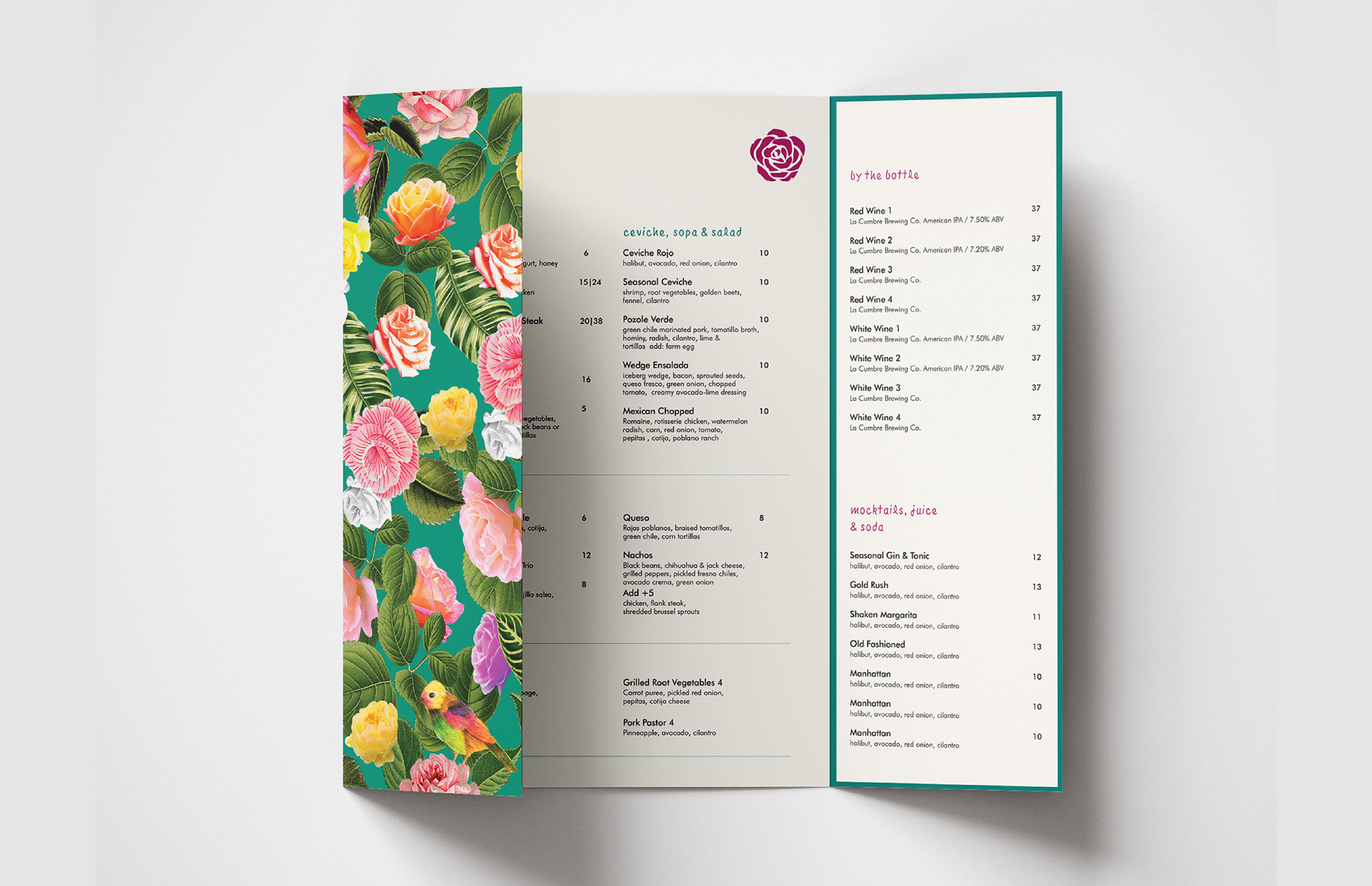
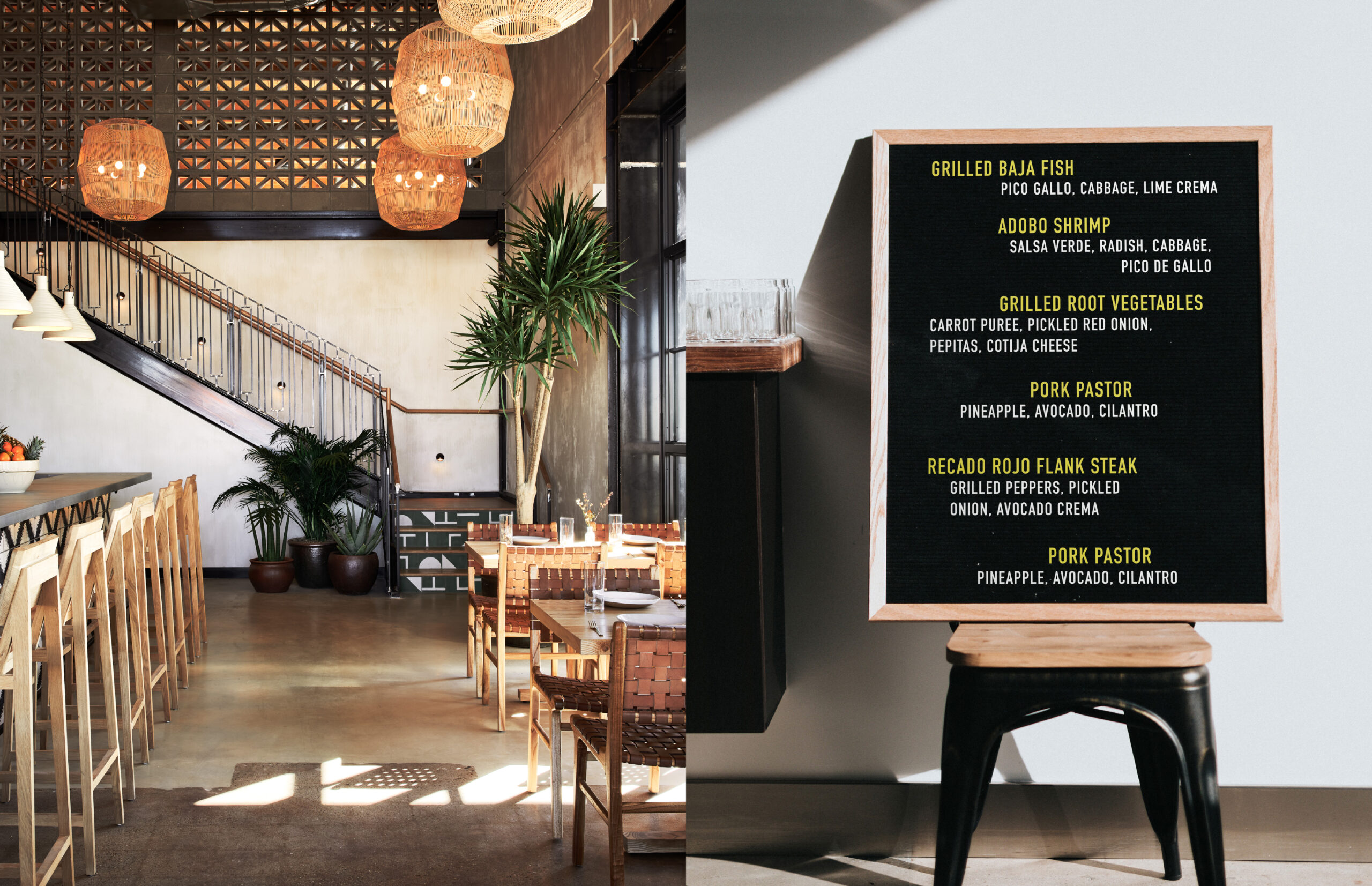
Flora invites you on a journey to Mexico, unveiling a treasure trove of vintage Oaxacan delights sourced from a local antique dealer. Embracing wood, charcoal, and rotisserie cooking, the menu boasts a fervor for vibrant, unadulterated flavors.
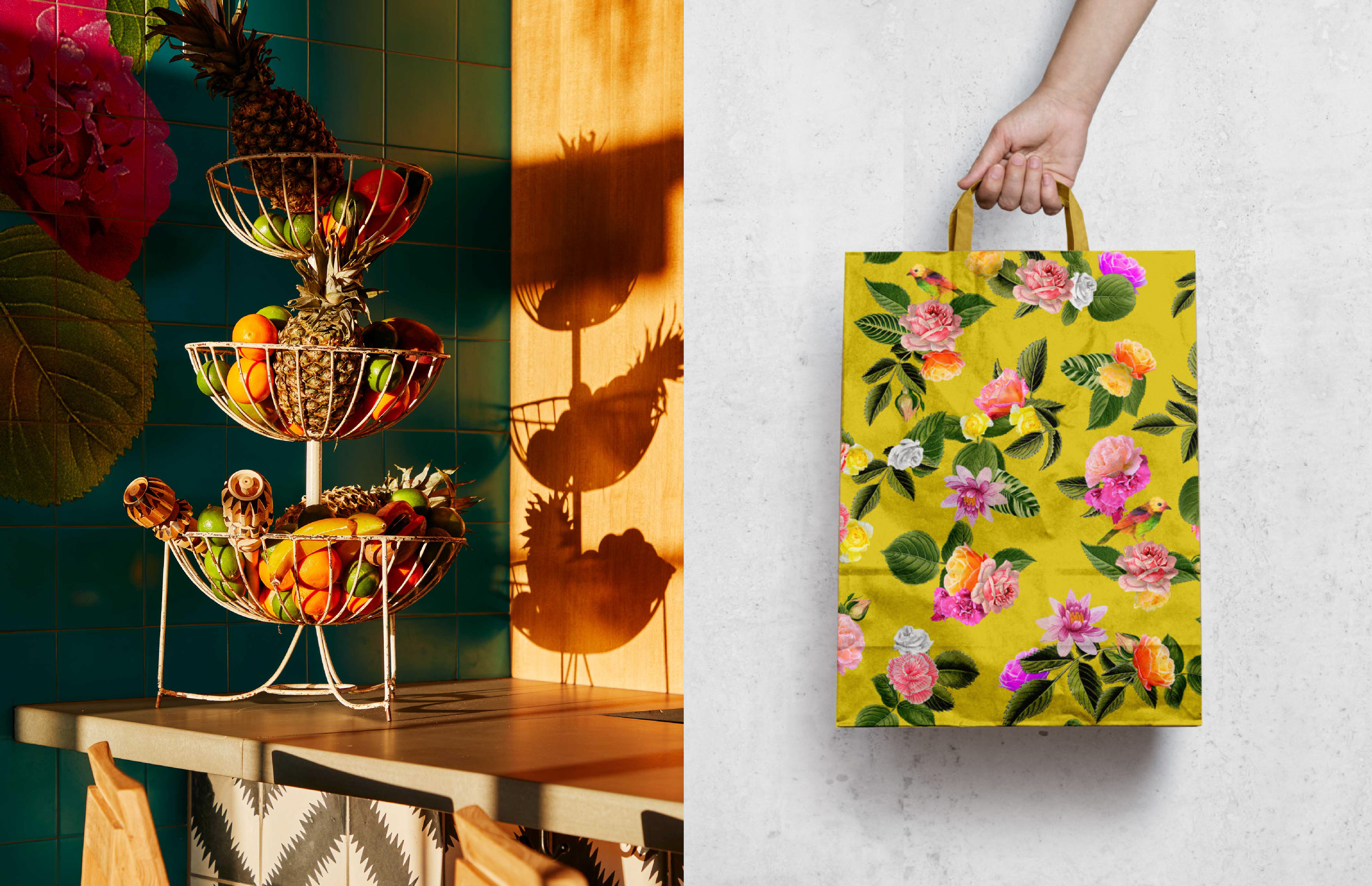
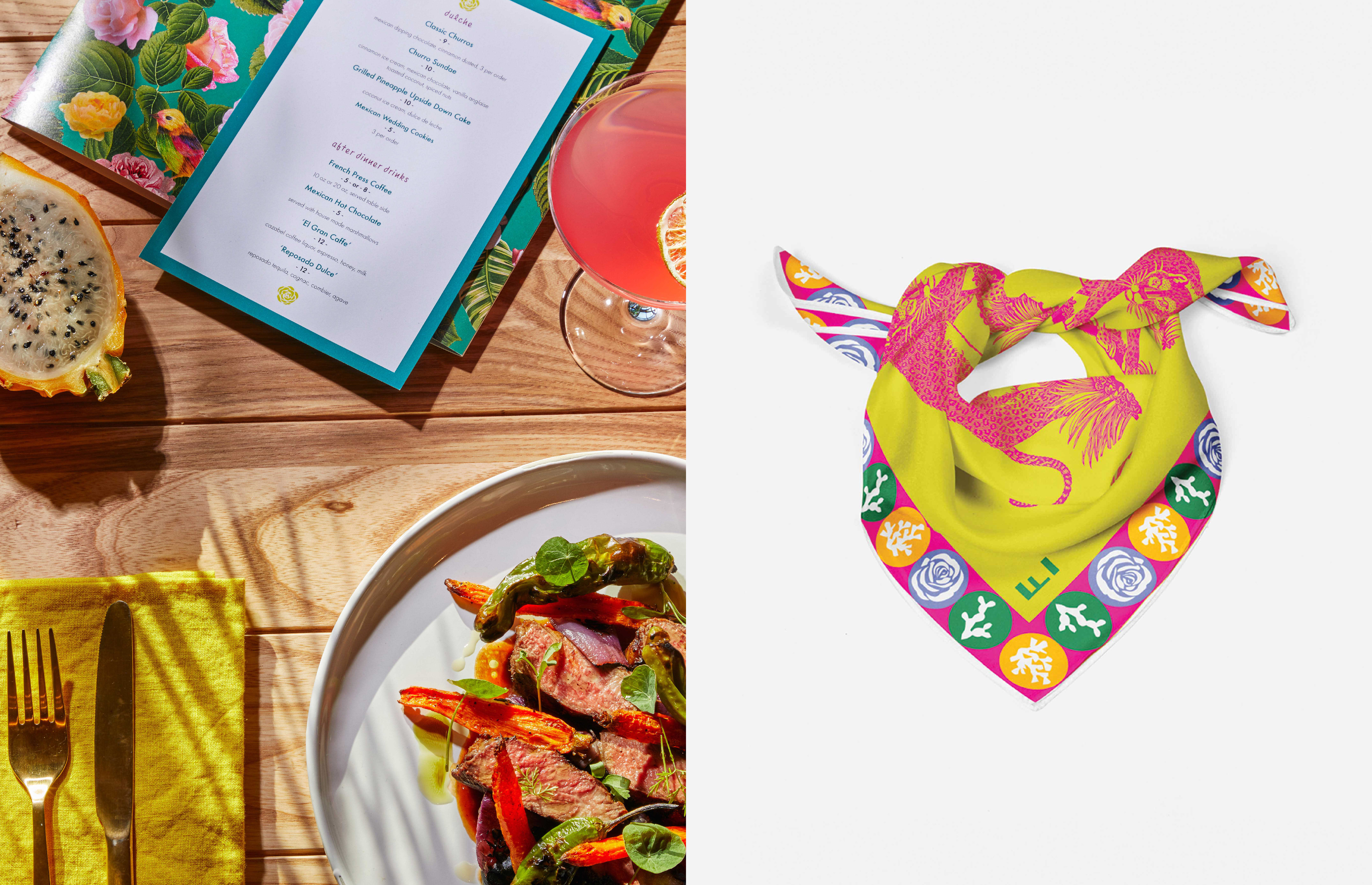
In crafting its graphic identity, Flora merges contemporary design with the essence of traditional craftsmanship. The vivid color palette draws inspiration from the captivating architecture and artistry of Mexico City, breathing life into the brand.
SCOPE
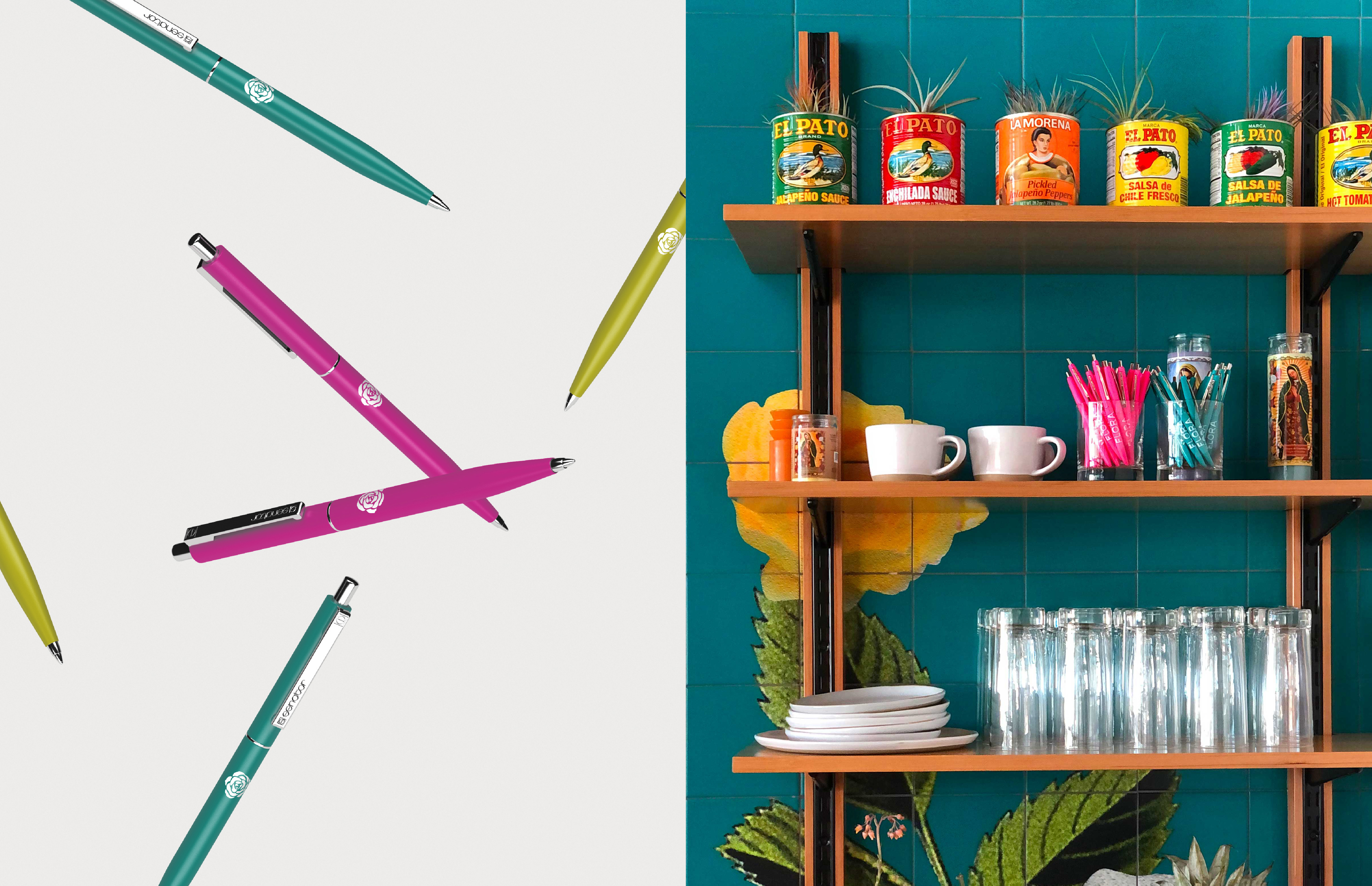
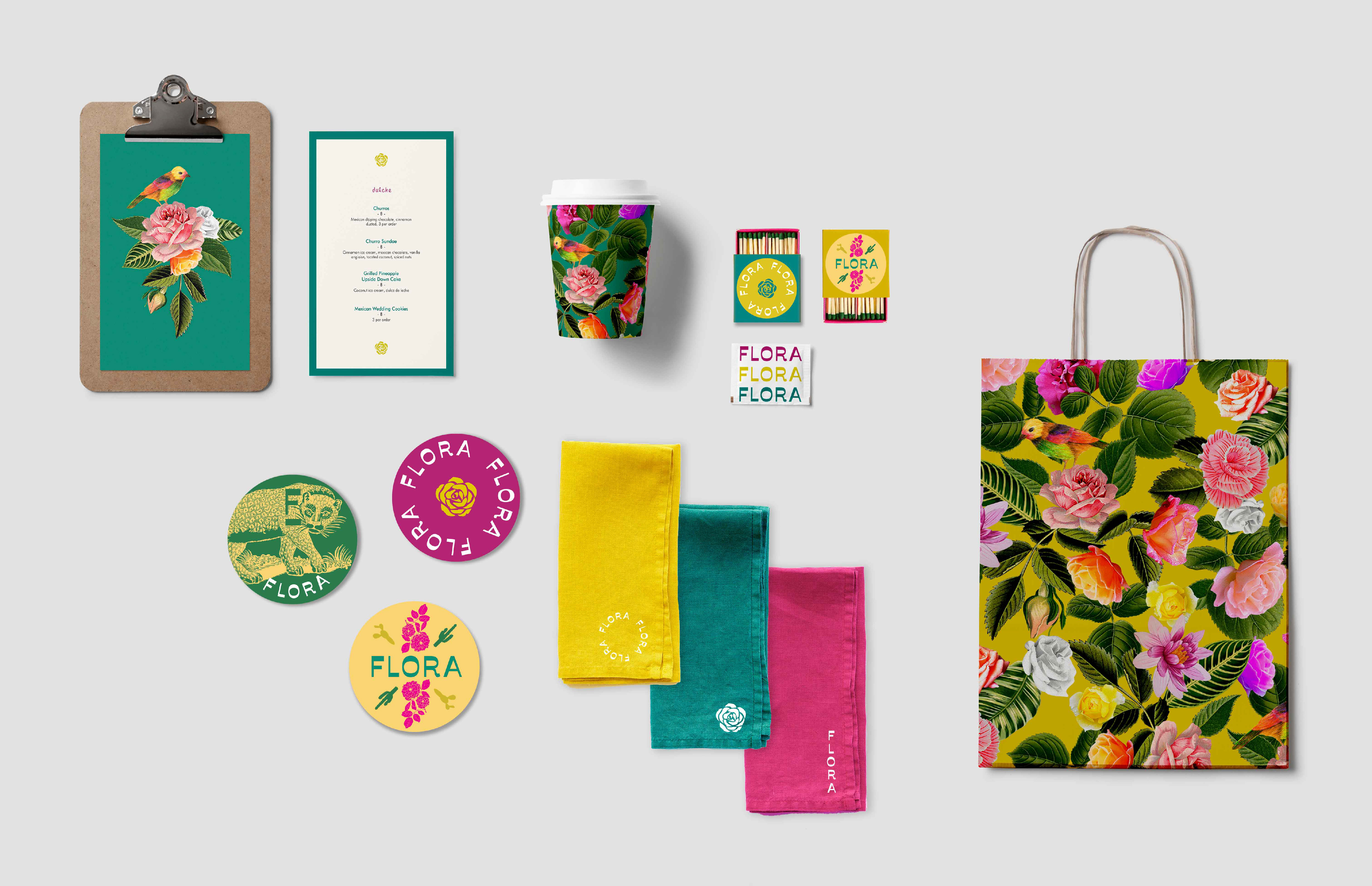
Brand Identity
Printed Collateral
Signage
CREDITS
Photography: Read McKendree
Studio: Islyn Studio
Client: Heritage Hotels & Resorts
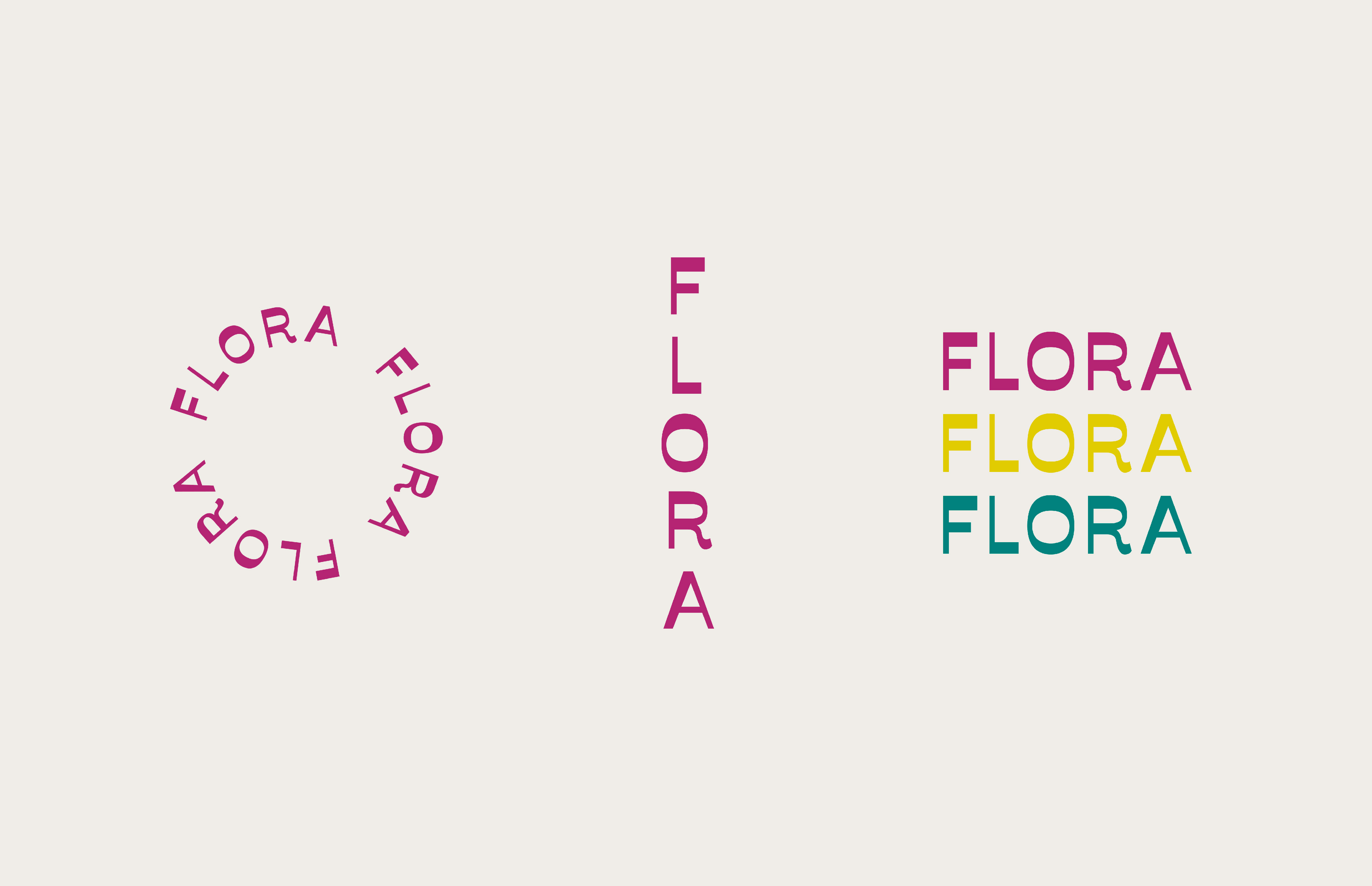
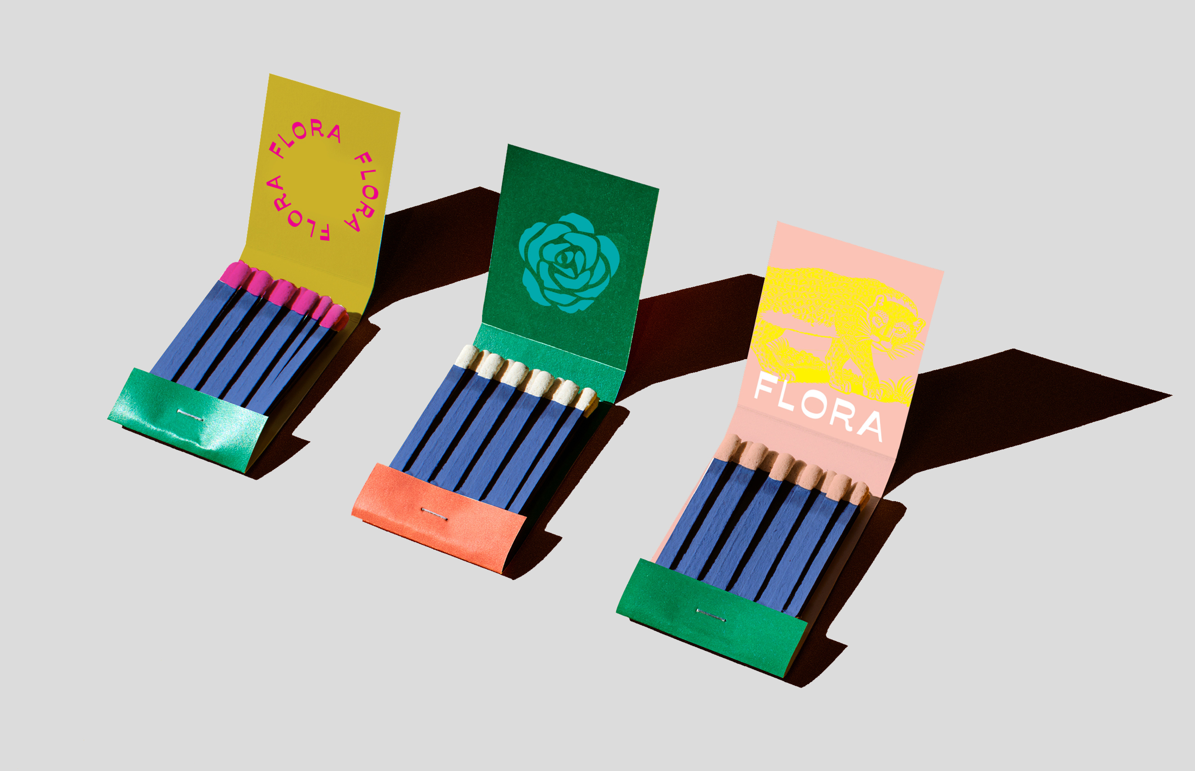
Our logo for Flora embodies a sense of boundless creativity and playfulness, reflecting an eclectic charm. It defies convention—stacked, straight, curved—the logo dances across mediums, infusing the brand with a spirited, unconfined identity that knows no boundaries. This flexibility encapsulates the free-spirited nature of Flora, inviting patrons into a world where rules take a backseat to boundless imagination.